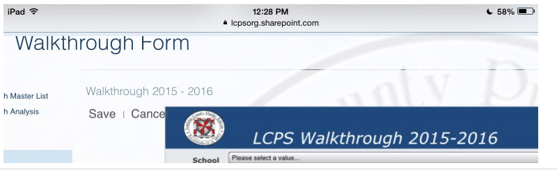
In your SharePoint online(or on premise) sites when you have end-users requesting just a form to submit via their mobile devices and nothing else as in the links in left navigation panel, as the site is not responsive to mobile devices and the form’s view gets snipped as seen in the pic below
and generally difficult to use for those that want to submit multiple items quickly, you can try the below solution that I implemented which solved the issue with form view.
- Create a custom page and call it mobile view form or something to that effect that makes it easy for users to link when they are in their mobile devices
- Inset the form web part and display the new item form in the web part
- Include a script editor web part and paste the code below:
<style type=”text/css”>
#contentBox {
margin-left: 0px;
}
#sideNavBox{
display:none;
}
</style> - What this does is, it hides the left navigation panel in your SharePoint site page and sets the size to be 0. So all that is in your mobile page is just theform for submitting data. You can set the redirect link for the page to be the one for mobile form submit as well and it’ll take care of the issue for your end users.

Left navigation panel fixed
