Once you setup a site and it starts getting traffic there would come a time when you get curious as to how many users are actually visiting your site.
Daily/Monthly weekly? What would you do?
Just use Performance Analytics + Excel Web Access webpart and create a super cool dashboard in half an hour that is extremely functional and serves the purpose. I’m all about leveraging Out of the box solutions.
Picture speaks a thousand words, videos speak a thousand pictures, check out the first video below:
Get the Usage.xlsx
Inset Excel Web Access web part
So its all fine and dandy, functional as well. All good, but what if we don’t want the excel sheet look in the dashboard page? Cosmetic appeal and we have a workaround for that as well.
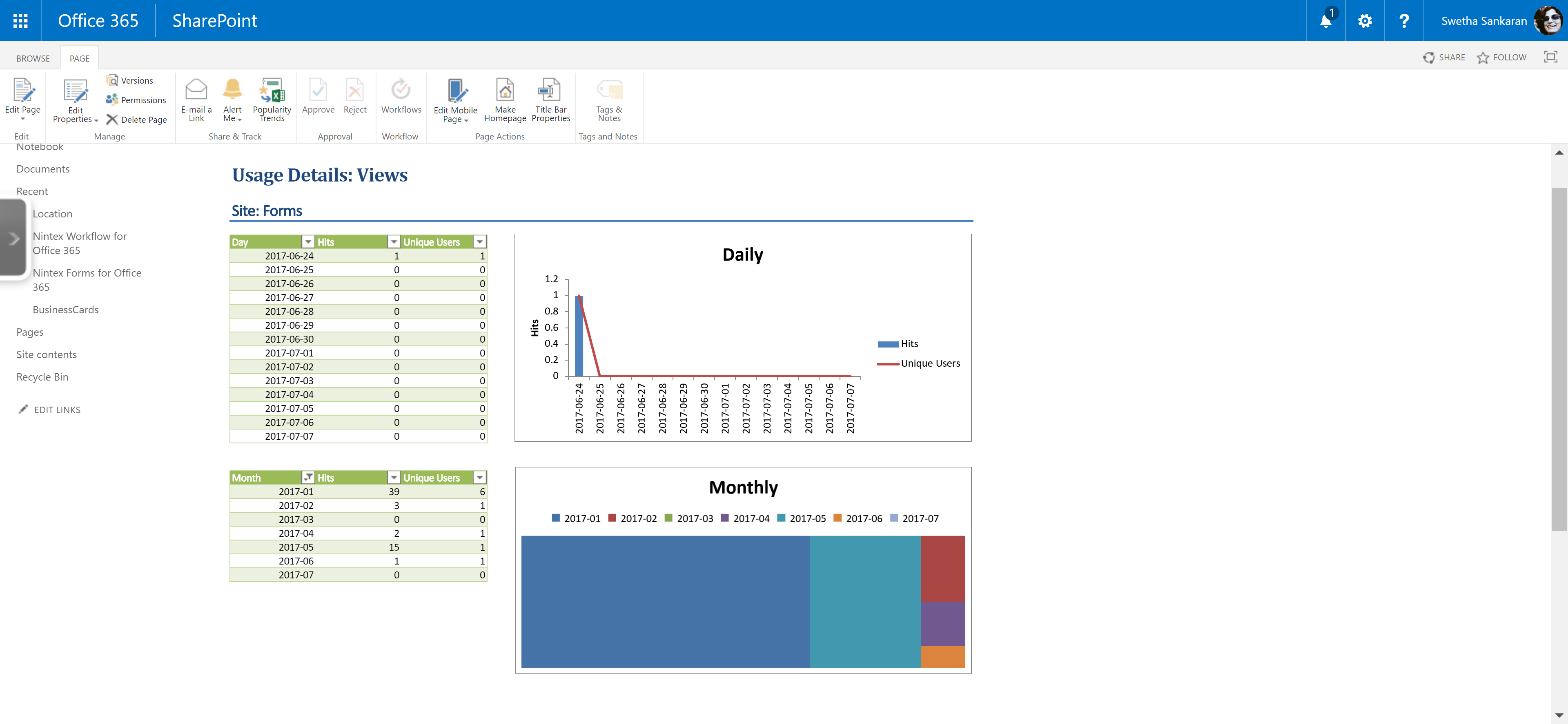
When Performance Analytics creates the report, there are two named PivotTable/PivotChart: DailyData1, MonthlyData1 which are included in the Excel Web Access web part by default.
We can customize the chart/report to our hearts content, yes, make it pink/blue/3D/4D whatever else you can do with your magical Pivoting skills, knock yourself out…lol! Now is your chance. Once you are satisfied with your creativity, select the area you want to display, create a new Defined Name and include the Pivot Tables and Pivot Chart sections.
Now in your SharePoint Usage Dashboard site page, include the custom Defined Name in the web part properties and Voila! Your clean/ non excelly(yes its a word I made up) dashboard is ready!! Yay!!!

Video showing how to set the new Defined Name(Dashboard) to the sitepage for a cleaner looking Site Usage Dashboard page.
Here is the final dashboard site page

Discover more from QubitSage Chronicles
Subscribe to get the latest posts sent to your email.